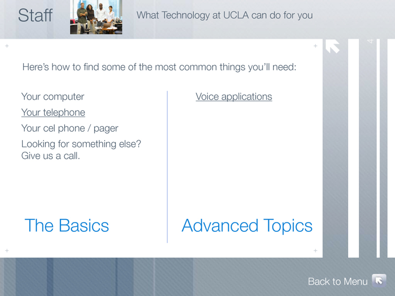
PrevNext
The UCLA homepage, as it was in 2005. The technology portal redesign project was just beginning, and the site was made with Vignette CMS, an unwieldy and cumbersome CMS.
When I started working on this redesign project, the technology portal site was so unintuitive, that I was asked to design an orientation to explain to users how to navigate the site to find what they needed. After I drafted an orientation, I advocated for actually bringing user-centered design into the redesign process, and joined the initiative committee.
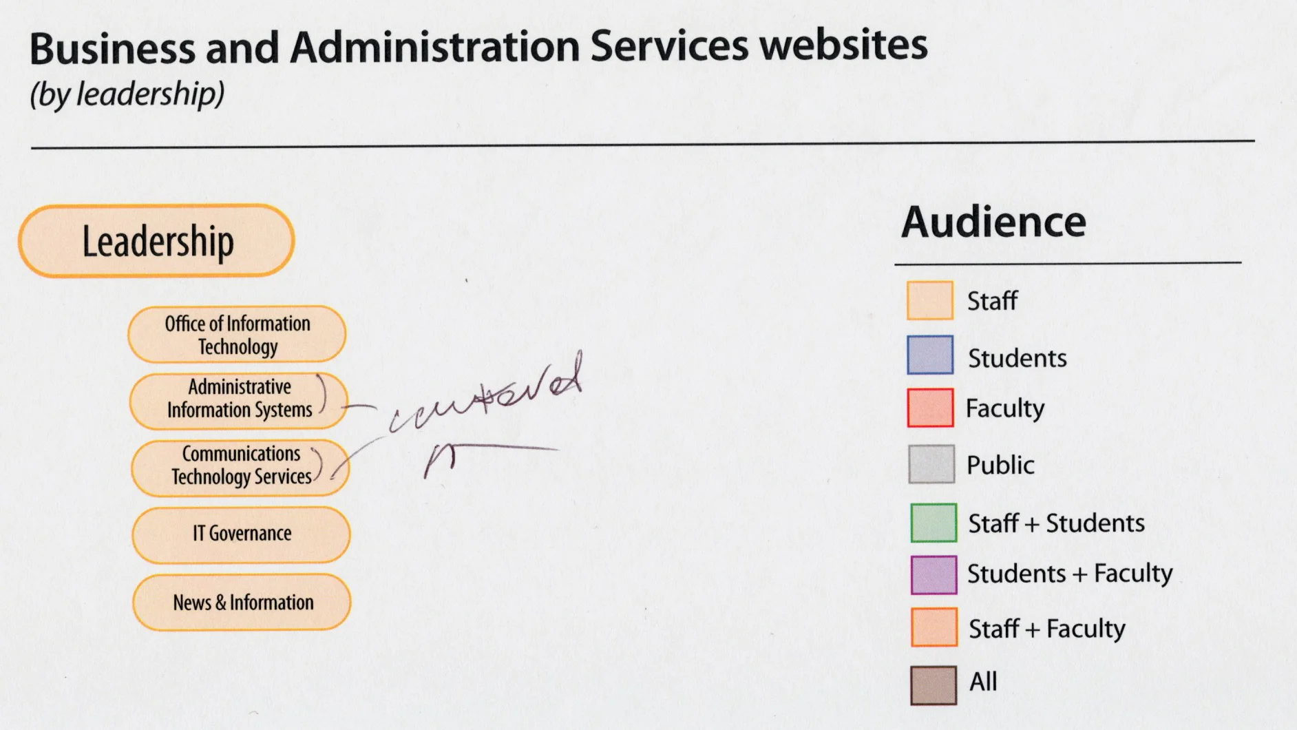
The existing sitemap was organized by department, which wasn't very useful for the end user, unless they were intimately familiar with the university's org chart.
Page 1 of a first pass at a content audit, broken down by audience. There were a few hundred pages.
In 2009, the campus portal was updated slightly. Still using Vignette.
A mockup of the proposed landing page for Phone Services, a subset of the Technology site.
A screenshot of the proposed redesign, in the CMS.
The first page of one of the user testing surveys, given between iterations of mockups in the CMS.
A taxonomy of a subsite, broken down by service.
A more granular version of the content audit.
A taxonomy of a subsite, broken down by audience and task.
The old campus portal from 2009-2013, based on the Vignette CMS. Endless meetings went into the taxonomy, layout, and hierarchy of the site, with biweekly meetings for years. I used to have nightmares about being stuck inside this layout.
After the user card sorting, the taxonomy evolved into more useful categories.
The university's branding was updated in 2012, and with it, the main website. The website began to transition from Vignette to the new platform, Plone.
More of the 2012-present site.
On this subpage, the left-hand navigation menu that's persistent throughout the second-tier pages is visible.
A rare full-bleed image.
The IT Services site in 2014, using the same layout and style as the main campus gateway.