

In 2013, the intranet was migrated to a Plone platform, to match the new look of the main UCLA site. The modified navigation reflected the merger of two organizations' intranets into a single site.
The staff intranet, circa 2005. It wasn't structured very well; it mirrored the org chart, and actually had a number for people to call if they couldn't find something on the site. While it's always a good idea to have a contact number for a real human somewhere on the site, it's a bad idea to rely on that as a navigational philosophy.
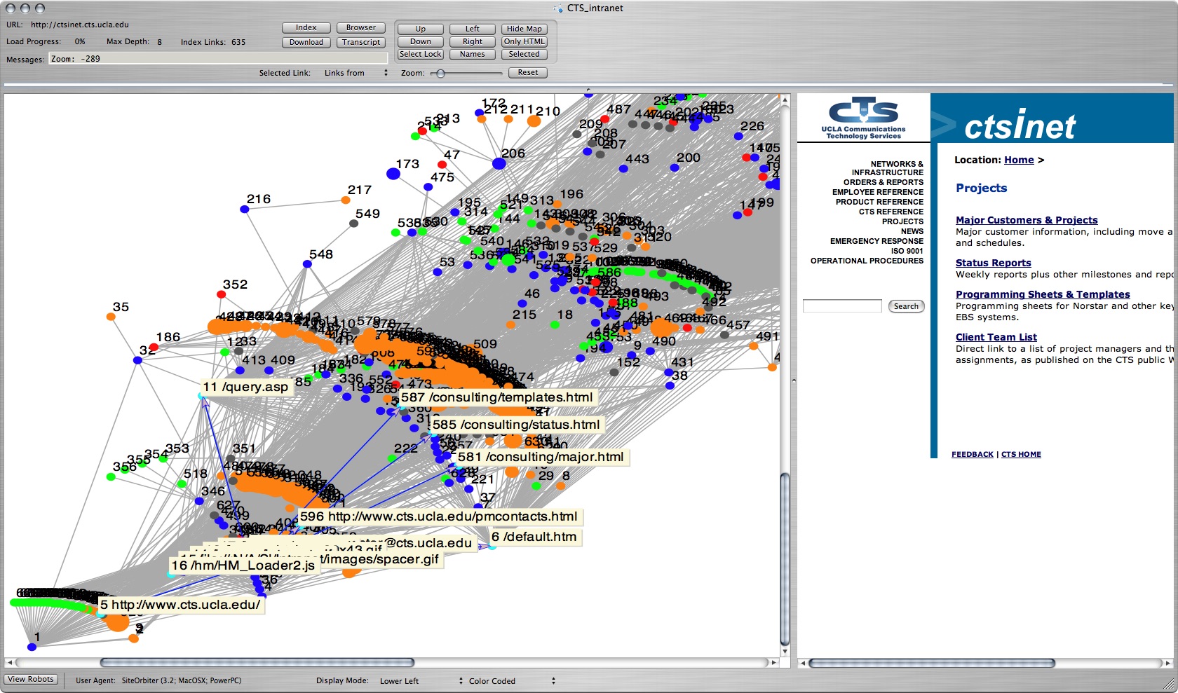
The mess that was the old intranet's site tree. Oy.
Another proposed redesign that never got off the ground, but the revised, user-centered navigation, and structure got approved. (At last!) The new navigation and site structure were the result of user surveys, stakeholder meetings, and a lot of card sorting, to determine how each section should be organized.
My notes after a stakeholder meeting with the director about the redesign, circa 2009.
In 2009, the intranet was redesigned using the 960 grid structure, for a dynamic site experience. RSS feeds populated the main page and news sections; the dynamic upgrades & outages calendar was added and functional, and the navigation was streamlined.
A second-tier page: the necessary HR section.
In 2009, the intranet was redesigned using the 960 grid structure, for a dynamic site experience. RSS feeds populated the main page and news sections; the upgrades & outages calendar was added and functional, and the navigation was streamlined.
A proposed 2005 redesign which never quite got off the ground, because its navigation wasn't particularly workable. Sometimes, you have to show the client just how much their idea isn't actually feasible, before you can move on, and this was one of those times.
A proposed dashboard interface for the managed network services team's section of the intranet. As with all dashboards, content is shoehorned in.
In 2013, the intranet was migrated to a Plone platform, to match the new look of the main UCLA site. The modified navigation reflected the merger of two organizations' intranets into a single site.
My team had to migrate all the content from our division's old intranet into Plone fairly rapidly; the other group we were working with had fallen behind schedule. We made up for lost time, and migrated everything in 22 days. We lost a lot of sleep, but it was worth it to meet the deadline.
Another page from the 2013 Plone-based redesign.
One of the challenges of this site design was that it suffered from a lack of new content; no single group had ownership of the site. Instead, each department was assigned a 'web champion,' who in theory would write articles and updates for their department… but in practice, people get busy, and non-critical tasks get forgotten about.
A page from the 2013 Plone-based redesign.
The events listing page was reasonably fresh, but it still relied on someone manually creating each event, rather than pulling from existing event calendars.
