
Overview: The UCLA technology portal
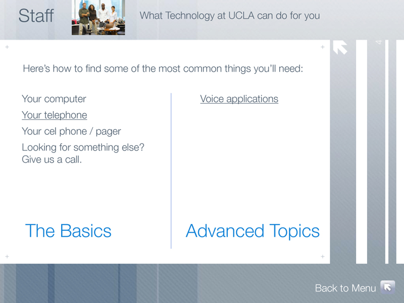
The UCLA campus website portal's technology section was originally a hierarchy-based design, that required the user be intimately familiar with the university's org chart in order to find what they were looking for. Once again proving the xkcd joke about university websites true, the site's design was so unintuitive that it used to require an orientation for the user — that's suboptimal, from a user's perspective. You shouldn't need to have to take a tutorial in order to find out how to set up your email account, or order a phone, nor should you have to know that a group called CTS were the right people to talk to for either of those things.
There was a lot of evangelism that had to happen, in order to get consensus on a task-based and audience-based navigation and architecture. Often, what won the argument was the results of the user research and testing we did on the site. A vice-chancellor knows the organization, so a site that mirrors it works great for them… but it's not so great for a freshman who's just arrived on campus and needs help getting their laptop set up, and has no idea where to go or who to talk to. Different users have different needs, and designing the site so that it met all of them was challenging.
A multidisciplinary team of developers, engineers, librarians, designers, and stakeholders from students to executives all were part of the initiative to redesign and restructure the site, creating a user-centered design that was far more usable. Here's some project notes, mockups, and screenshots of the process.


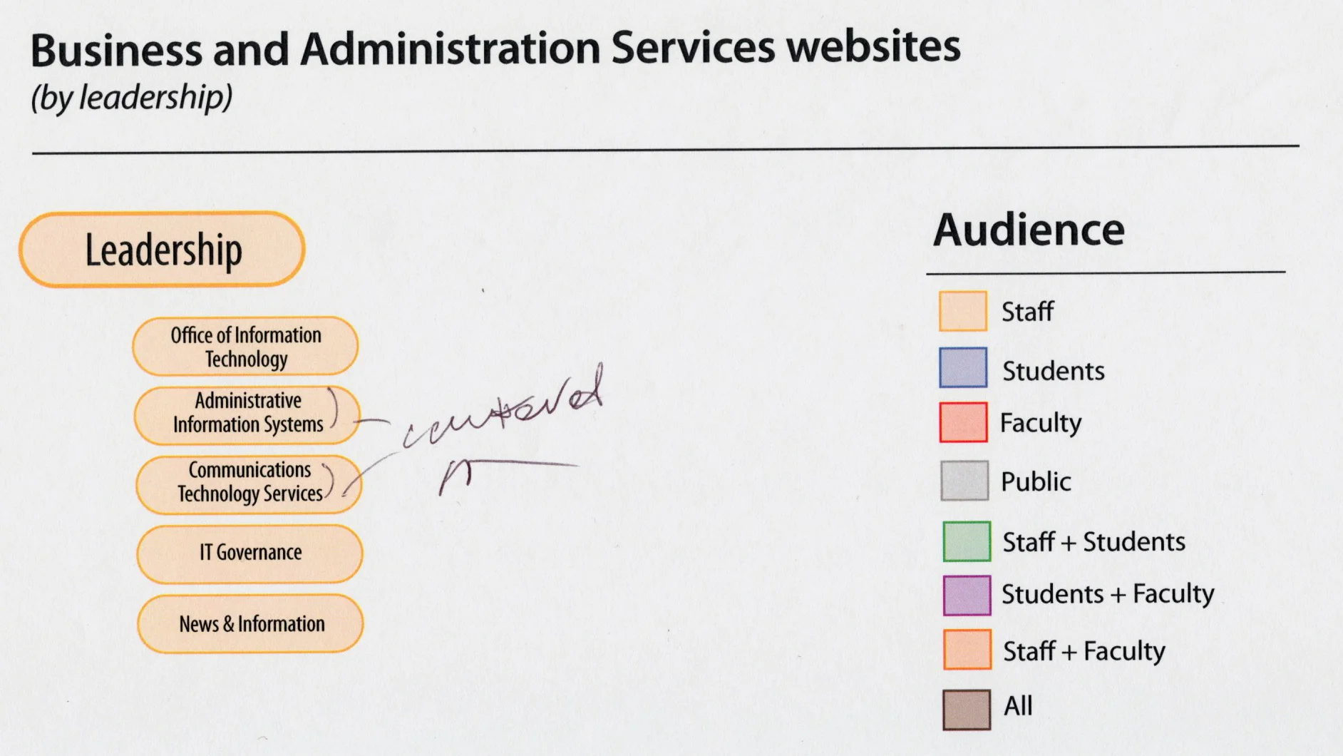


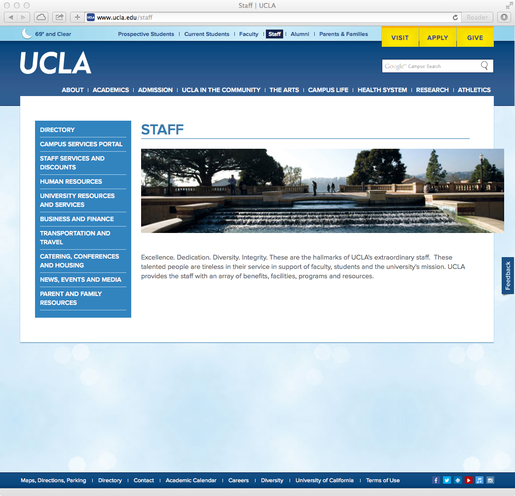


The UCLA campus portal redesigns have been a joint effort of several groups across University Communications and IT Services (formerly Academic Information Systems and Communications Technology Services). Note: the main campus site screenshots are provided as context for the university's evolving site design over the years.