
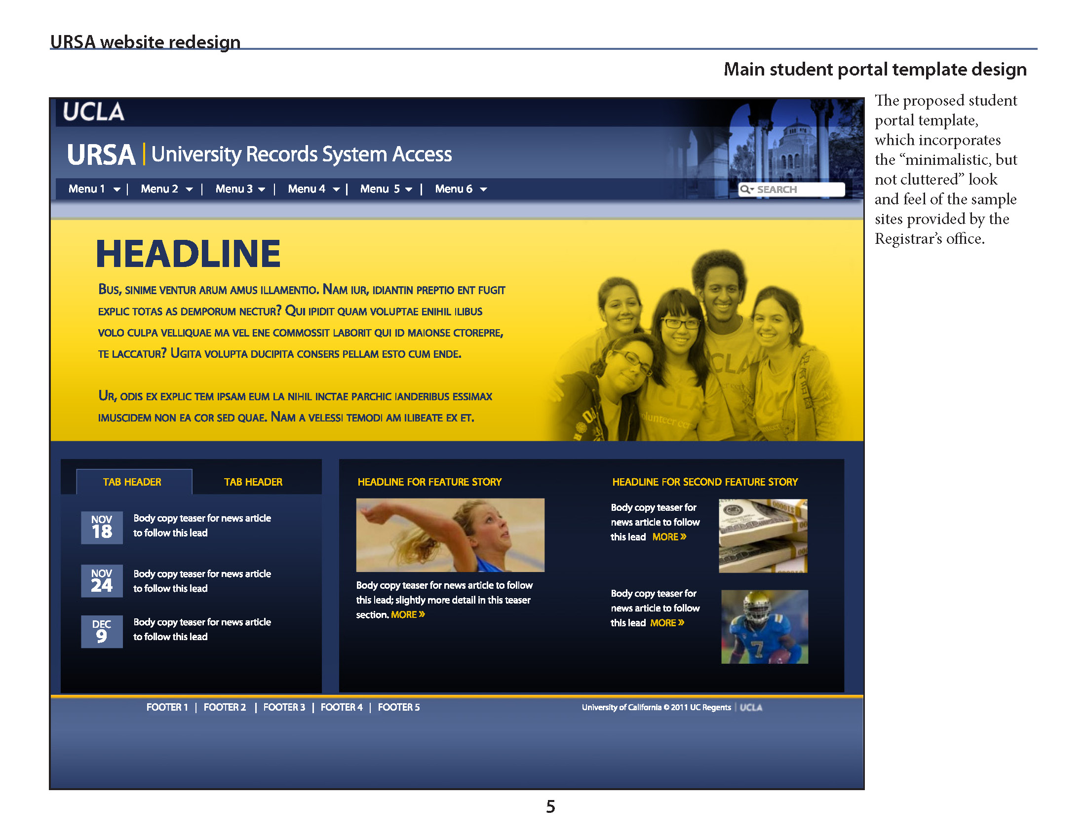
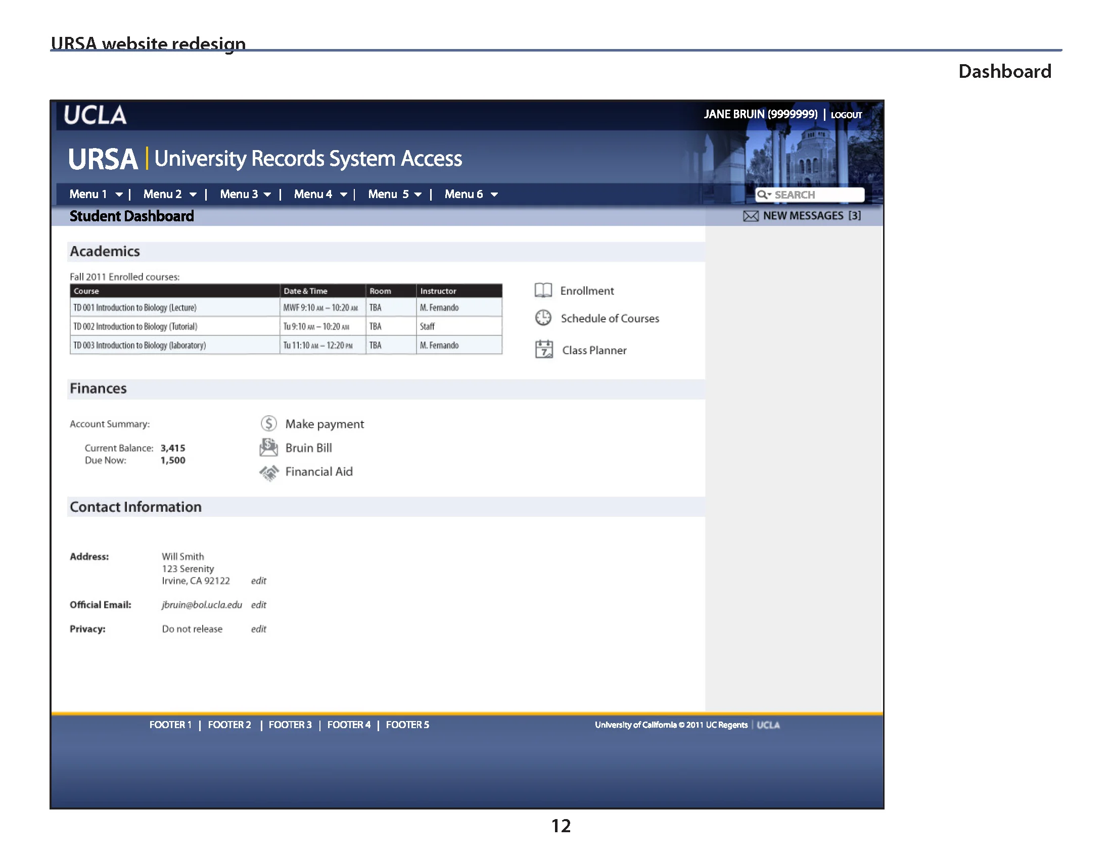
Overview: URSA student registration site.
A fairly typical web project: redesign an existing website to update its look, feel, and functionality. The client was the Registrars' Office, who wasn't happy with another group's attempt at redesigning the site, and came to my team for help. The main goal was streamlining the process students had to endure when registering for classes, and presenting the information they needed, at the right point in the registration process, without having to continually go back to the landing page to discover whether or not they'd paid their library fines, or something else that would prevent them from registering for class. (A secondary goal of mine was to get rid of the bitmapped image of the bear next to the 386-era computer, and the yellow paw prints on a white background as a design motif. Achieving that goal was much harder than you'd think.)
This site was unusual, because it only addressed one audience on campus: students. It's rare to get to only have to consider the needs and wants of one user group, which made creating user stories and scenarios much simpler.


Unfortunately this design got scrapped — even though the client loved it — as the URSA site became rolled into an integrated student portal. That's just the way it is, sometimes.